Create with confidence — and better blocks
Posted by download in Software on 26-03-2020
In the last few years, the teams working on the block editor have learned a lot about how people build sites now and how they want to build sites in the future.
The latest version represents the culmination of these discoveries, and the next stage in the editor’s evolution.
With better visuals and more advanced features, it’ll keep designers, developers, writers, and editors productive and happy, and — tension-building drumroll — it’s in your editor right now!
What’s new
With a comprehensive visual refresh, a plethora of new features, and dozens of bug fixes, the new block editor comes with a lot to unpack.
What follows is just a small (but delectable) sample of the many ways we’ve upgraded your editing experience. (You can get the full list of goodies in the release notes.)
We hope you enjoy.
A revamped editor UI
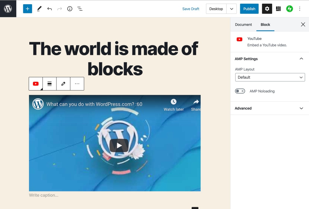
The first thing you’ll notice is the slick UI. Buttons, icons, text, and dropdowns are all sporting a contrast boost, with bolder colors and more whitespace between buttons, text labels, and menu items.
As you navigate through the editor’s menus, individual items are clearly highlighted, allowing you to quickly identify what you’ve selected.
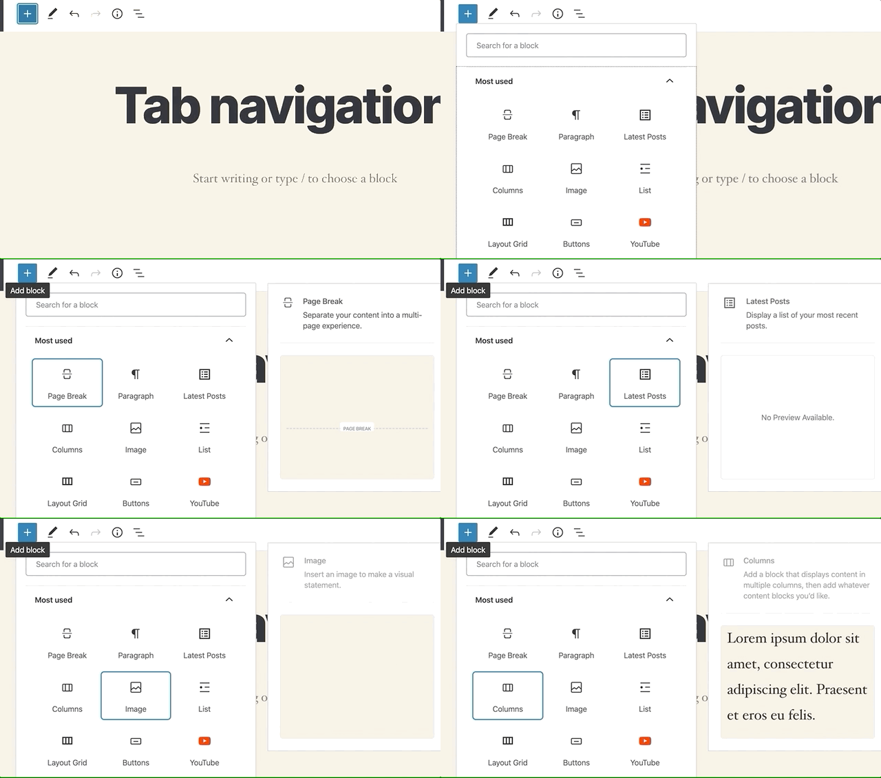
The block toolbars are now simpler, displaying the most commonly-used features. For example, paragraph blocks show only bold, italic, and link formatting buttons. You’ll find all the extra options in the dropdown menu.
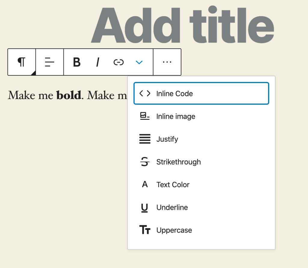
What’s more, instead of listing blocks within a fixed-height container, the block inserter now spans the height of the window. You’ll now see more blocks and block categories at once with less scrolling.

Introducing block patterns
With the block editor as your canvas you can design almost any layout you can imagine – but building intricate page structures should never get in the way of your creative process.
Here’s where the blocks really shine: along with individual blocks, the editor now includes block patterns, a library of predefined and reusable block layouts, that you use on any page or post.
To check out the list of available patterns, click on the block pattern icon (on the top right) to reveal a collection of pre-built layouts:

Pick the pattern you want to use, and it will appear in your editor ready for you to customize with your own content.
Right now, you’ll find a few introductory patterns – Two Columns of Text, Two Buttons, Cover, and Two Images Side by Side – but we’ll be adding more and more patterns as they’re available. When the block patterns API opens up to third-party authors, you’ll also be able to develop and share your own.
(Have an idea for a great pattern? The block editor developer community is actively seeking ideas. The more ideas they receive, the better your editor will be!)
Colors, colors everywhere
When it comes to words and columns, websites aren’t newspapers: things don’t have to be black and white.
Use the new Text Color selector tool to change the color of sentences, and even individual words and letters. Highlight the text you’d like to change, then click on the arrow dropdown and select “Text Color.”
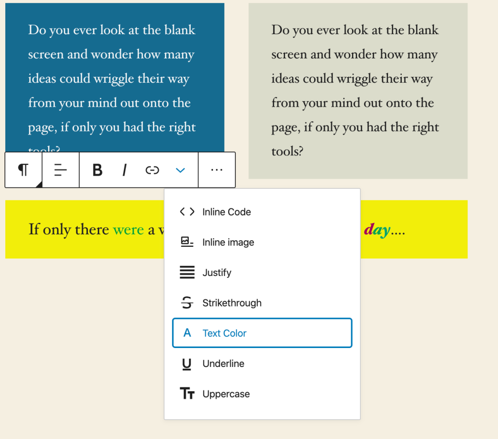
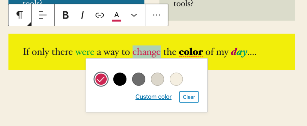
To change the background colors of your columns, select the column and head to the sidebar, to Color settings.

The road ahead is paved with blocks
There’s still a long way to go, and the editor’s community of contributors hasn’t given its collective keyboards a moment’s rest. Work on polishing UI elements like the sidebar and dropdowns continues along with advancements to block patterns and other exciting features.
Are there ways we could improve the site editing experience even more? Please let us know! We’re always keen to hear how we can make the web a better place for everyone.
