10 Ways to Make Your Site More Accessible
Posted by download in Software on 21-05-2020
Today, Global Accessibility Awareness Day, raises awareness around digital access and inclusion and improving the web experience for everyone. This year, WebAIM analyzed one million homepages for accessibility issues and found that 98% of websites had at least one WCAG (Web Content Accessibility Guidelines) failure on their homepage, such as low-contrast text, missing image alt text, and empty links. These types of accessibility barriers make it difficult or impossible for some visitors — people who are blind, deaf and hard of hearing, and disabled, for example — to use your site.
We encourage you to audit your site to ensure it’s accessible for all readers; the WAVE (Web Accessibility Evaluation Tool) can identify various errors on your site in seconds. Here are some web accessibility tips to get you started, and be sure to explore the guidelines and resources on the W3C Web Accessibility Initiative (WAI) website for deeper learning.
Use an accessibility-ready theme
You can choose from among a variety of designs for your site, but some themes have features that add complexity, making it harder for disabled people or visitors using screen readers to access your content.
When choosing a theme, consider an accessibility-ready design, like Balasana, a free minimal theme for your business website; or Mayland, a free visual theme that’s great for photographers and storytellers. These themes have been checked by the Theme Review Team and pass basic accessibility requirements.

Display your site title and tagline
Many themes allow you to upload a custom header image, which is a visual way to brand your site, display the title of your blog, or promote the name of your business. But some themes may not support alternative text, or the written copy that appears in place of an image on a page if the image fails to load on your visitor’s screen.
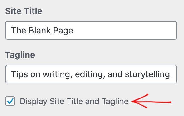
Instead of conveying your site title and tagline within a header image, display your site title and tagline text. Go to Manage → Settings, and at the top under Site profile, fill out your Site title and Site tagline. Then, head to Design → Customize, go to Site Identity, and check the box next to Display Site Title and Tagline.
Structure your pages and posts with appropriate headings
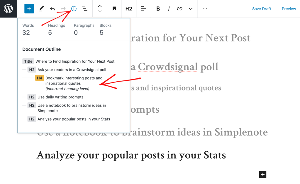
Add headings with the Heading Block to organize pages and posts and make it easier for readers to follow your content, which is especially important for longer pages and posts. Click on the “i” icon in the top toolbar of the block editor to view any errors and incorrect heading sizes.
Select fonts and colors for legibility
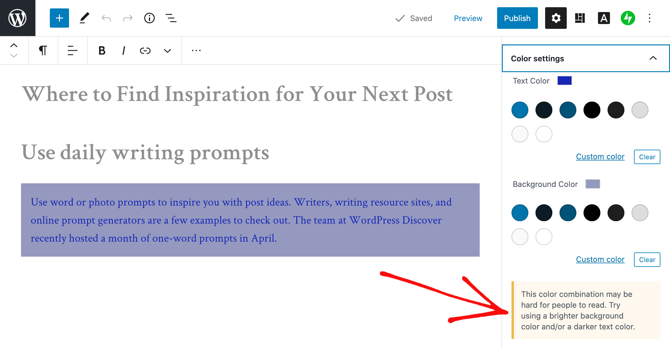
Fonts and colors are essential components on your site, adding personality and style and strengthening your visual identity online. Avoid font styles and sizes and color palettes that make your site difficult to read, and pay attention to contrast, or the difference between the darkness of your text and the lightness of your background.
The block editor will display an error message in Color settings when it detects poor color contrast in the specific block you’re working on.
Clearly describe your links
When linking to another page or post on the web, make your linked text descriptive. For example, “click here” is not as effective as “learn how to apply to my writing workshop.”

Include captions with your images
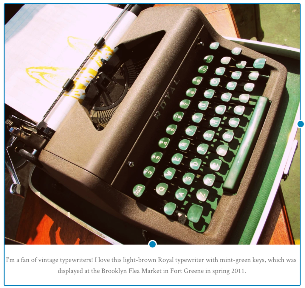
When adding an image with the Image Block, add a description of the image in the caption underneath it. While captions are optional, they improve the experience for all readers by providing more context.
Add alt text to your images
Alt text is essential for people who are blind or use screen readers (they can hear alt text read aloud), or people who have disabled images for speed or bandwidth reasons. Alt text is also important for your site’s SEO — it helps search engines understand what your site content is about.
When adding an image with the Image Block, go to the block’s settings on the right and add the alt text in the box under Image settings.
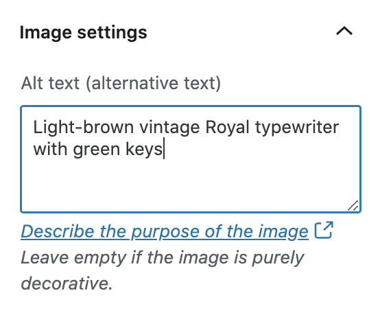
Learn more about W3C’s image accessibility guidelines.
Create easily clickable CTA areas
With the Buttons Block, you can add call-to-action buttons to your pages and posts quickly. For those of you who design and embed your own buttons with Image Widgets, make buttons, icons, and other CTA elements with wide-enough areas that are easy to click or tap from different devices.
You can apply this tip to text links as well. Tapping a linked hashtag or asterisk within a sentence, for example — especially on a small screen — may be difficult for some people.
Include captions or transcripts for multimedia content
If your site includes video content, consider adding captions or including transcripts (documenting speech, sounds, as well as actions seen on-screen). Podcast transcripts are also incredibly helpful; here’s a transcript of a recent Distributed episode with neuroscientist Adam Gazzaley.
It’s best if video and audio content does not auto-play, but if that’s not possible, options to pause or adjust the volume should be obvious on the page.
Never stop learning and improving
This list is just an introduction to a few best practices and guidelines! If you’re interested in learning more, explore the resources on the W3C Web Accessibility Initiative (WAI) website. You can also explore ways to get involved in improving the accessibility of WordPress.
Learn more about Global Accessibility Awareness Day and participate in online events, webinars, and podcasts.
