Working Remotely Isn’t Just About the Work

Posted by download in Software on 25-05-2020

With COVID-19, the business world has come to a fork in the road: Down one route, shuttered offices. Down the other, companies embracing remote work, showing us how businesses can survive — and thrive! — with a fully remote workforce. And that includes fostering strong team bonds and employee relationships; just because there’s no physical break room or water cooler doesn’t mean companies can’t create opportunities for colleagues to connect.

Not all businesses can operate with remote employees, and the world’s frontline workers don’t have the luxury of dialing in from home. But for those companies that can function without a central office, there are myriad benefits to a distributed workforce. Automattic has always been fully distributed, and we’ve learned a lot about how to build a productive and happy remote workforce over the past 15 years. (CEO Matt Mullenweg is sharing many of these lessons and chatting with other folks running distributed companies on Distributed.blog and on the Distributed podcast.) Lots of companies find themselves suddenly switching to a remote work environment, and there’s a learning curve.

One of the things that can be seen as challenging is social interaction on the job, which plays a vital role in productivity and mental health. When employees build friendships and strong interpersonal relationships, they enjoy their work more and do a better job overall. And if you’re reading this, thinking you don’t know anyone whose work improves when they have strong social bonds among colleagues, you do now — it’s me! As an extrovert, I get energized when I’m able to see people and faces, especially in person, but also online. I’m a conversational learner, too, so ideas stick better in my brain when I have the chance to discuss and brainstorm topics in real time with teammates.

These days, it seems teleconferencing software is as commonplace as coffee shops in Seattle. “Zoom” has become part of our vocabulary, helping us to remain close with family and friends (albeit not physically), and it’s become fodder for marketing and advertising campaigns.

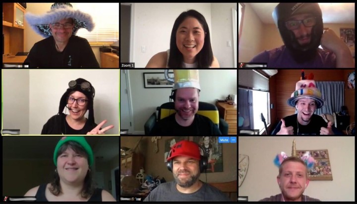
It’s also our preferred conference tool at Automattic, and we use it for a wide range of work gatherings, like town halls and team meetings. But that’s not all we use it for. Knowing that social communication is vital to ensuring a strong culture of camaraderie, we use Zoom to hang out together: We host open mic nights, break out our pencil crayons and color collectively, or do some chair yoga with one another. We’ll also grab a beverage of choice — coffee, beer, Soylent, tea, a crisp rosé — and join a happy hour.

In addition to maximizing online communication tools, we strengthen our collegial relationships offline. For example, we take advantage of the fact that we are distributed all over the world and send postcards to one another.

Whatever we do, we do it because we know that social connection is important. That we’re not going to work in the same physical office just means that we have to be more intentional about making the time, and carving out the (virtual) space, to connect with coworkers. To help inspire other businesses with newly distributed workforces, we’ve put together a resource that lists the many ways we communicate socially at Automattic. You can find it on this page.

Add a Post Carousel and Embed a Podcast Player in Seconds with Our Two Latest Blocks

Posted by download in Software on 22-05-2020

The WordPress editor keeps expanding its library of blocks, adding new and exciting functionality to websites on a regular basis. After a crop of new business-related blocks last month, our most recent additions will appeal to three communities we hold close to our heart: podcasters, podcast lovers, and bloggers.

Use the Podcast Player block to spread the word about your favorite episodes

Podcasts have been an unstoppable cultural force for several years now — and the format seems to have only grown in popularity in recent months, as so many of us are at home and looking for entertainment and (occasionally?) enlightenment.

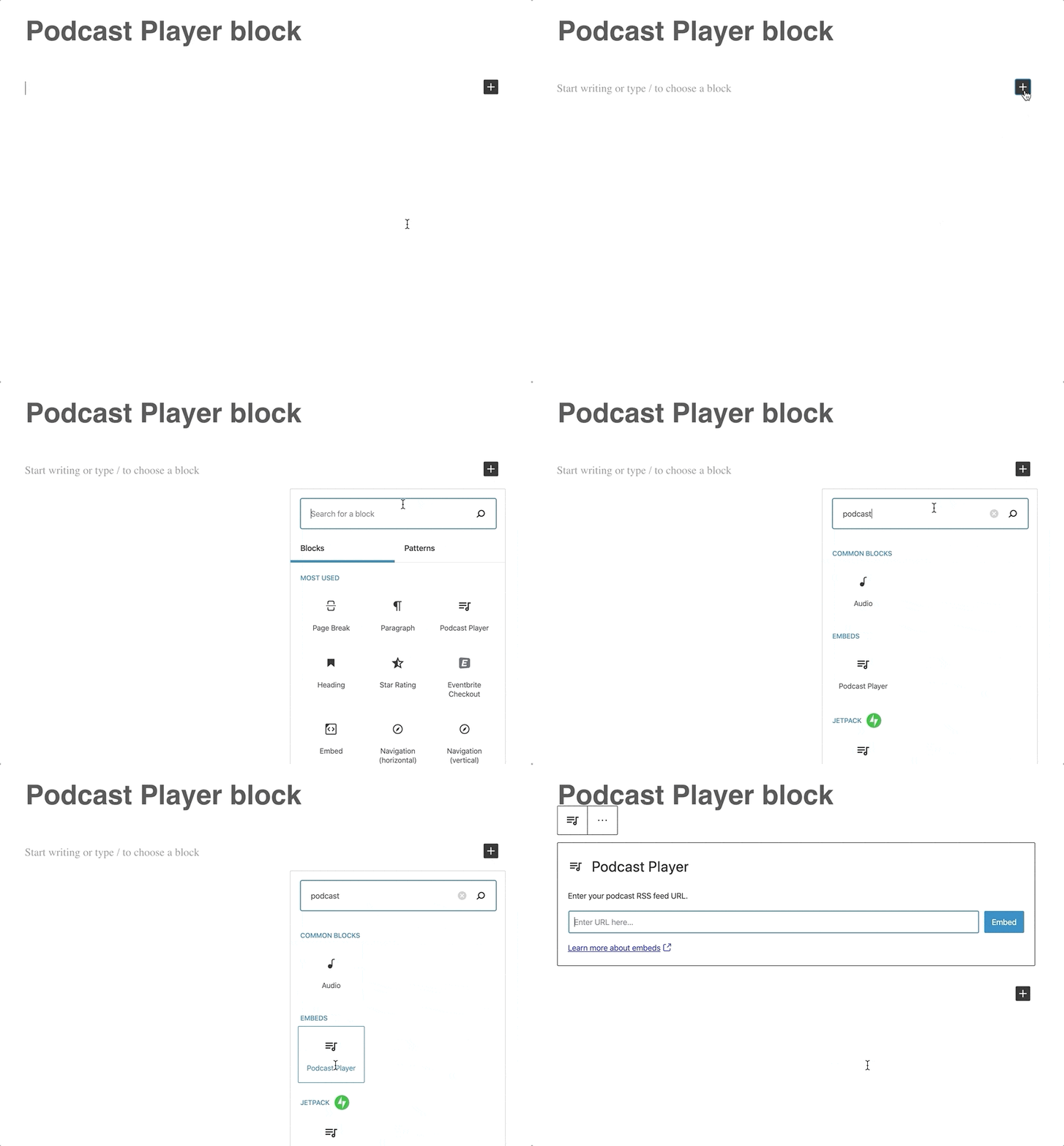
Are you a podcaster? Add the Podcast Player block to share your passion project with your visitors, embedding your podcast’s latest episodes on any post or page on your website. If you haven’t launched a podcast (for now, anyway), but are still an avid listener, you can now embed episodes from others’ shows within your own content so readers can listen to them without ever leaving your site.

Once you choose the Podcast Player block from the available blocks in the editor, you won’t need any special codes or embed links. The only information you’ll have to provide is the podcast’s RSS feed URL (not sure where to find it? The information will be readily available on your preferred podcast platform.) Here’s what the podcast player will look like on your site — the example below features the latest episode on the Distributed podcast, hosted by Automattic CEO Matt Mullenweg:

Episode 20: Adam Gazzaley on the Distracted Mind During a Crisis Distributed, with Matt Mullenweg

  1. Episode 20: Adam Gazzaley on the Distracted Mind During a Crisis

You can customize the Podcast Player block in a number of ways, from specifying how many of the most recent episodes to display, to deciding whether or not you’d like to show each episode’s description. Whether you feature your own podcast or someone else’s, you get to design the listener’s experience on your site. Learn more about adding and customizing the Podcast Episode block.

Keep readers reading with the Post Carousel block

Sooner or later, both veteran bloggers and newer creators encounter a similar issue: publishing frequently helps energize your audience (and gives you an SEO boost, too), but also makes older posts tougher to find.

The Post Carousel block comes to the rescue, providing an easy gateway to the treasures in your blog’s archives.

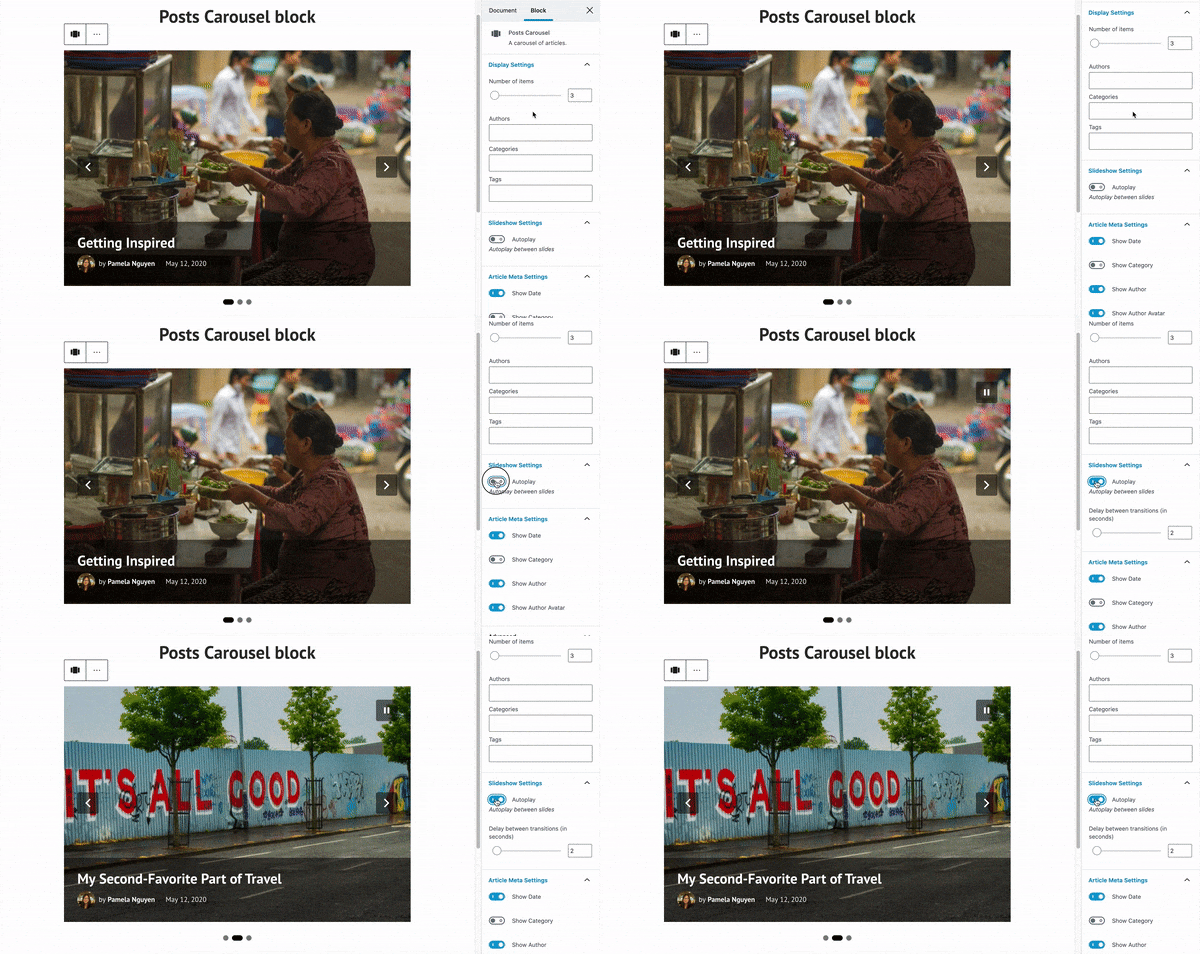
Add the Post Carousel block to any post or page on your site to encourage visitors to explore more posts (by default, the block will display your most recent ones). For a post to show up in the carousel, it needs to have a featured image; the idea is to engage and entice readers with strong visuals they’ll want to click on. To get a taste of the carousel in action, here’s one highlighting the five most recent posts on the WordPress.com Blog:

For a more curated experience, you can customize what the post carousel shows. A post about your cauliflower taco recipe might call for a carousel showing other recipes that share the “vegan” tag or category. If you run a multi-author online magazine, consider presenting other stories by the same contributor. You can also configure how many items each carousel displays and whether it automatically slides from one featured post to another (among other options). Learn more about adding and customizing the Post Carousel block.


We hope you give these two new blocks a try — leave a comment if you have any questions, or if you’d like to share a link to a post where you’ve already used them.

Expert Advice: SEO and Content Marketing

Posted by download in Software on 21-05-2020

You’ve launched your website or started a blog. Congratulations! Now it’s time to attract an audience. You built a website to reach people with your art, ideas, or products and services. We’ve created a free online session to help you do just that. 

Register for our next 60-minute webinar, Traffic Control: How to Find and Grow an Audience for your Website, to get advice and guidance on attracting the right people to your site.

Date: May 27, 2020
Time: 10:00 a.m. PDT | 11:00 a.m. MDT | 12:00 p.m. CDT | 1:00 p.m. EDT | 17:00 UTC
Cost: Free | Register now
Who’s invited: Content creators, online publishers, and small businesses looking for the best ways to build an audience of loyal customers and dedicated readers.

Topics will include:

  • Understanding your audience.
  • Demystifying SEO.
  • How to optimize your site for local visitors.
  • What does “quality content” really mean?
  • Using email, social media, and paid advertising.
  • How to take advantage of WordPress.com’s marketing tools for audience growth.

Hosts Chris Smith and Kasey Steinbrinck run their own sites and both have worked with a variety of businesses to help them optimize their websites and create strong content. They’ll help you choose what to focus on so that you can make the most of your time. 

After working as an SEO specialist for many years, Chris supports WordPress.com customers with expert advice as a Happiness Engineer. Kasey started his career as a TV news producer and entertainment writer before becoming a content marketer and an independent blogger. Today he works on WordPress.com’s content strategy.

The 60-minute webinar will include detailed instructions on WordPress SEO as well as a Q&A session. Seats are limited so register today to reserve your spot.

10 Ways to Make Your Site More Accessible

Posted by download in Software on 21-05-2020

Today, Global Accessibility Awareness Day, raises awareness around digital access and inclusion and improving the web experience for everyone. This year, WebAIM analyzed one million homepages for accessibility issues and found that 98% of websites had at least one WCAG (Web Content Accessibility Guidelines) failure on their homepage, such as low-contrast text, missing image alt text, and empty links. These types of accessibility barriers make it difficult or impossible for some visitors — people who are blind, deaf and hard of hearing, and disabled, for example — to use your site.

We encourage you to audit your site to ensure it’s accessible for all readers; the WAVE (Web Accessibility Evaluation Tool) can identify various errors on your site in seconds. Here are some web accessibility tips to get you started, and be sure to explore the guidelines and resources on the W3C Web Accessibility Initiative (WAI) website for deeper learning.


Use an accessibility-ready theme

You can choose from among a variety of designs for your site, but some themes have features that add complexity, making it harder for disabled people or visitors using screen readers to access your content.

When choosing a theme, consider an accessibility-ready design, like Balasana, a free minimal theme for your business website; or Mayland, a free visual theme that’s great for photographers and storytellers. These themes have been checked by the Theme Review Team and pass basic accessibility requirements.

Examples of six accessibility-ready designs from the WordPress.com Theme Showcase

Display your site title and tagline

Many themes allow you to upload a custom header image, which is a visual way to brand your site, display the title of your blog, or promote the name of your business. But some themes may not support alternative text, or the written copy that appears in place of an image on a page if the image fails to load on your visitor’s screen.

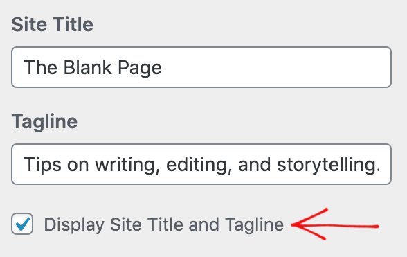
Instead of conveying your site title and tagline within a header image, display your site title and tagline text. Go to Manage → Settings, and at the top under Site profile, fill out your Site title and Site tagline. Then, head to Design → Customize, go to Site Identity, and check the box next to Display Site Title and Tagline.

The module in My Sites where you insert your Site Title and Site Tagline

Structure your pages and posts with appropriate headings

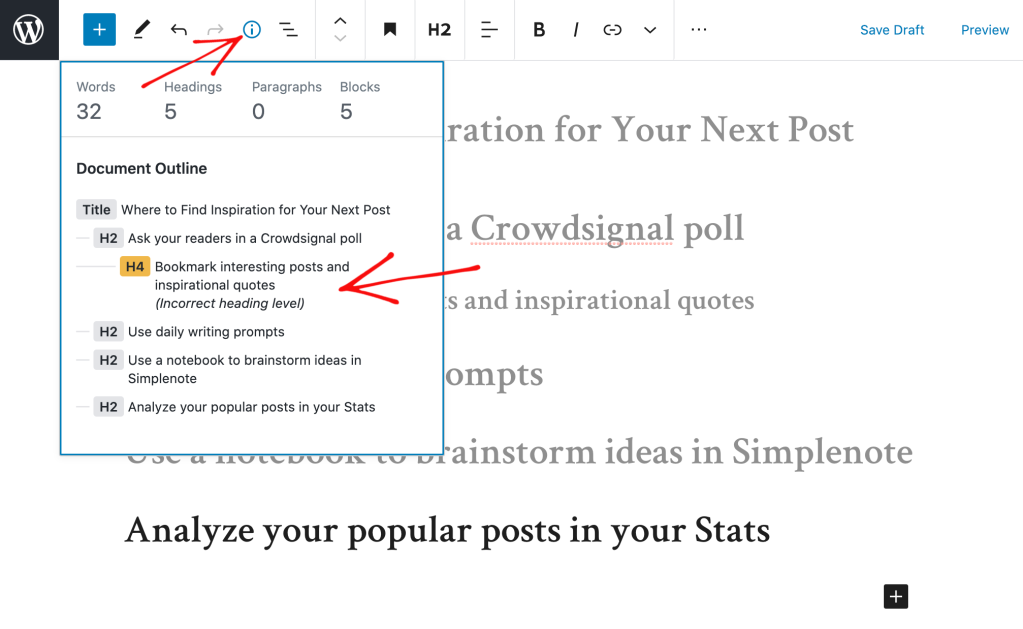
Add headings with the Heading Block to organize pages and posts and make it easier for readers to follow your content, which is especially important for longer pages and posts. Click on the “i” icon in the top toolbar of the block editor to view any errors and incorrect heading sizes.

A popup box that appears in the block editor with information on headings and the structure of your post or page

Select fonts and colors for legibility

Fonts and colors are essential components on your site, adding personality and style and strengthening your visual identity online. Avoid font styles and sizes and color palettes that make your site difficult to read, and pay attention to contrast, or the difference between the darkness of your text and the lightness of your background.

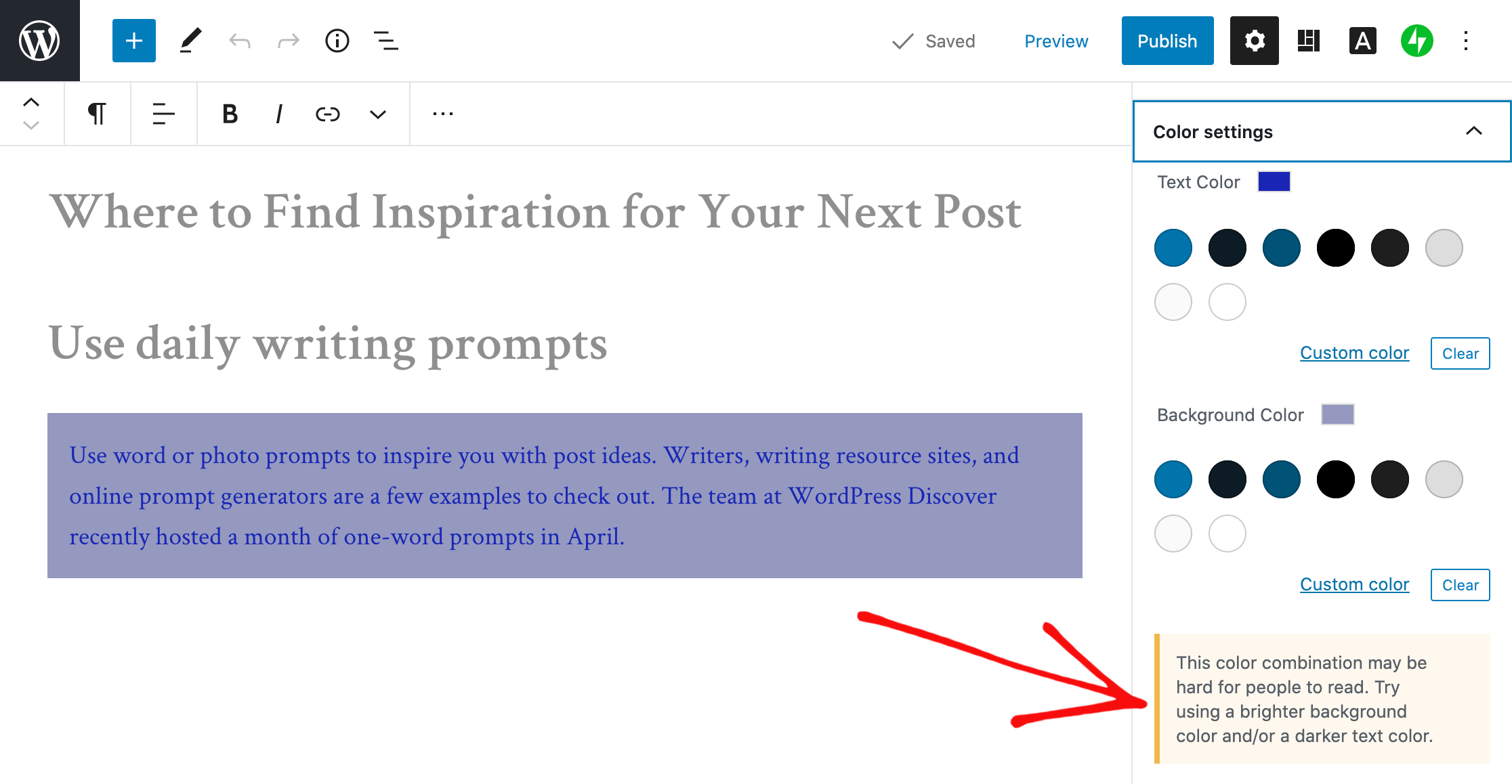
The block editor will display an error message in Color settings when it detects poor color contrast in the specific block you’re working on.

An error message that is displayed in the sidebar of the block editor when low color contrast is detected

Clearly describe your links

When linking to another page or post on the web, make your linked text descriptive. For example, “click here” is not as effective as “learn how to apply to my writing workshop.”

A short paragraph with correctly linked text

Include captions with your images

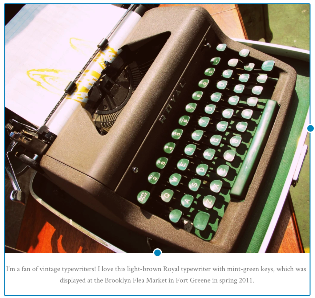
When adding an image with the Image Block, add a description of the image in the caption underneath it. While captions are optional, they improve the experience for all readers by providing more context.

A photo of a vintage typewriter with a caption

Add alt text to your images

Alt text is essential for people who are blind or use screen readers (they can hear alt text read aloud), or people who have disabled images for speed or bandwidth reasons. Alt text is also important for your site’s SEO — it helps search engines understand what your site content is about.

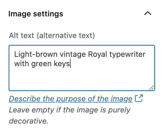
When adding an image with the Image Block, go to the block’s settings on the right and add the alt text in the box under Image settings.

An example of image alt text written in the Alt Text field in the Image Block's settings

Learn more about W3C’s image accessibility guidelines.

Create easily clickable CTA areas

With the Buttons Block, you can add call-to-action buttons to your pages and posts quickly. For those of you who design and embed your own buttons with Image Widgets, make buttons, icons, and other CTA elements with wide-enough areas that are easy to click or tap from different devices.

You can apply this tip to text links as well. Tapping a linked hashtag or asterisk within a sentence, for example — especially on a small screen — may be difficult for some people.

Include captions or transcripts for multimedia content

If your site includes video content, consider adding captions or including transcripts (documenting speech, sounds, as well as actions seen on-screen). Podcast transcripts are also incredibly helpful; here’s a transcript of a recent Distributed episode with neuroscientist Adam Gazzaley.

It’s best if video and audio content does not auto-play, but if that’s not possible, options to pause or adjust the volume should be obvious on the page.

Never stop learning and improving

This list is just an introduction to a few best practices and guidelines! If you’re interested in learning more, explore the resources on the W3C Web Accessibility Initiative (WAI) website. You can also explore ways to get involved in improving the accessibility of WordPress.


Learn more about Global Accessibility Awareness Day and participate in online events, webinars, and podcasts.

Say Hello to the WordPress Block Editor

Posted by download in Software on 19-05-2020

On June 1 we’ll be retiring our older WordPress.com editor and transitioning to the more recent (and more powerful) WordPress block editor. Want to know how this may affect your site and what you can expect? Read on.

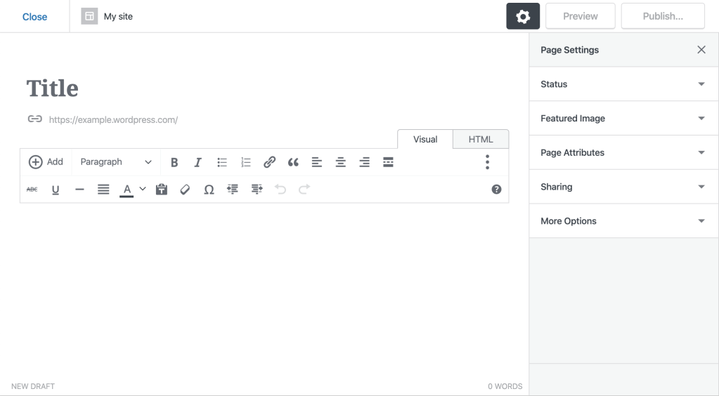
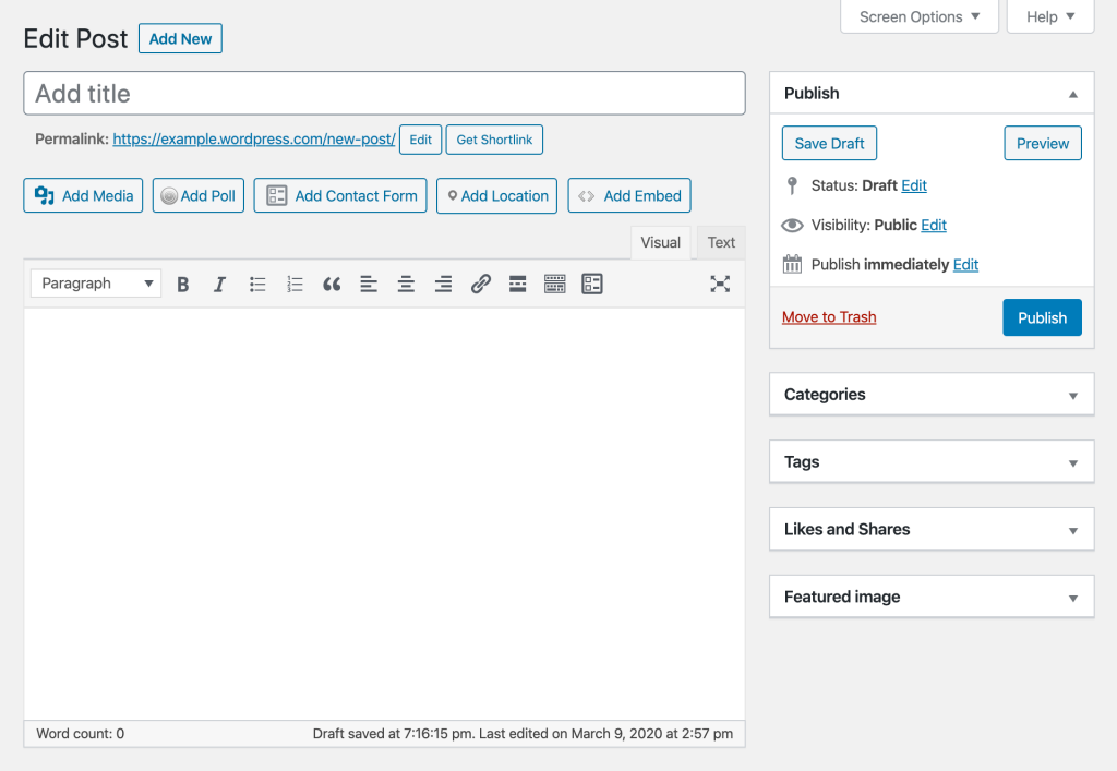
If you’ve launched your WordPress.com site in the past year and a half you may have never seen our older editor and are likely already using the more recent WordPress editor. Those of you who have an older site, though, might recognize this editing experience:

We know it can be frustrating to get used to an online tool only to see it change or go away. Retiring an entire editor — the place where you publish posts and pages on WordPress.com — is not something we would ever do on a whim. What inspired us to take this decision is the positive experience site owners have had with the newer WordPress editor.

Why switch to the WordPress editor? Let us count the ways.

The WordPress block editor was released over a year and a half ago. Since then, it has improved in numerous ways thanks to thousands of enhancements and fixes  — to the point that we’re certain it offers a far superior experience compared to the older WordPress.com editor. Not sure? You can take the WordPress editor for a spin. In case you’ve never encountered it before, here are only some of the features you’ll find in the WordPress block editor that aren’t available in the older WordPress.com editor.

Over 100 content blocks for publishing virtually any type of page or post
Content blocks can be mixed and matched to customize the content of any page or post.

A growing collection of block patterns
Block patterns are simply collections of blocks pre-bundled together to form beautiful designs.

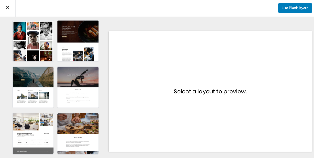
Dozens of beautiful, built-in page templates
Page templates simplify the creation of common pages within WordPress by giving you a beautiful predesigned template to get started.

Customizable styles directly within the editor
You can now customize the look and feel of your website by testing out different fonts directly within the WordPress editor.

What other options do I have?

We hope you give the WordPress editor a try — it’s been the editing experience of choice for millions since it arrived on the scene. That said, we know some of you might prefer to avoid this change. We’re offering two options for those who’d rather  stick with an older way of editing your content.

1) Use the Classic block
Within the new WordPress editor you’ll find the Classic block, which replicates the functionality of the Classic editor — that’s the editor that used to be the default until several years ago, well before we introduced the WordPress.com editor. Here’s what it looks like:

2) Opt to use the Classic editor
You also have the choice to switch to the Classic editor. Here’s what it looks like, in case you haven’t seen this one in a while (or ever):

We hope you enjoy the new WordPress editor — give it a try today to get a taste ahead of June 1!

Coming Soon: Make Your Site Private Until You’re Ready to Launch

Posted by download in Software on 15-05-2020

When you create a new site, you may want to personalize it before making it public. On WordPress.com, we give you a safe space where you can work on building and editing your site until you’re ready to share it with the world.

Until recently, this Coming Soon mode was limited to new sites without plugins or custom themes installed. We realize, however, that many users — regardless of how long they’ve had a website on WordPress.com — might want to make updates, change the design, or add new functionality without making these changes visible to the public until they’re complete. Now, all sites have this Coming Soon option, and you can toggle it on or off as you wish.

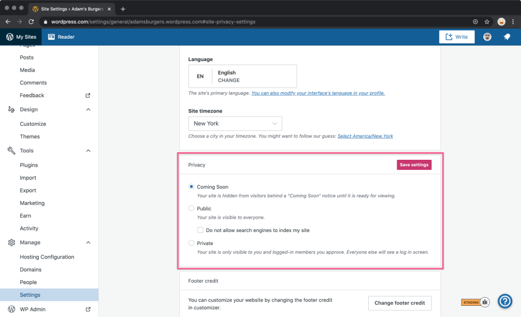
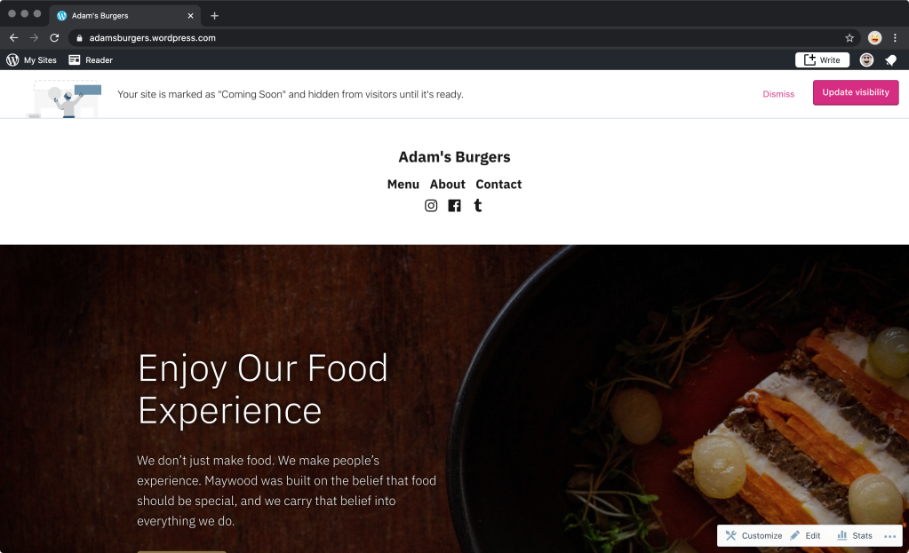
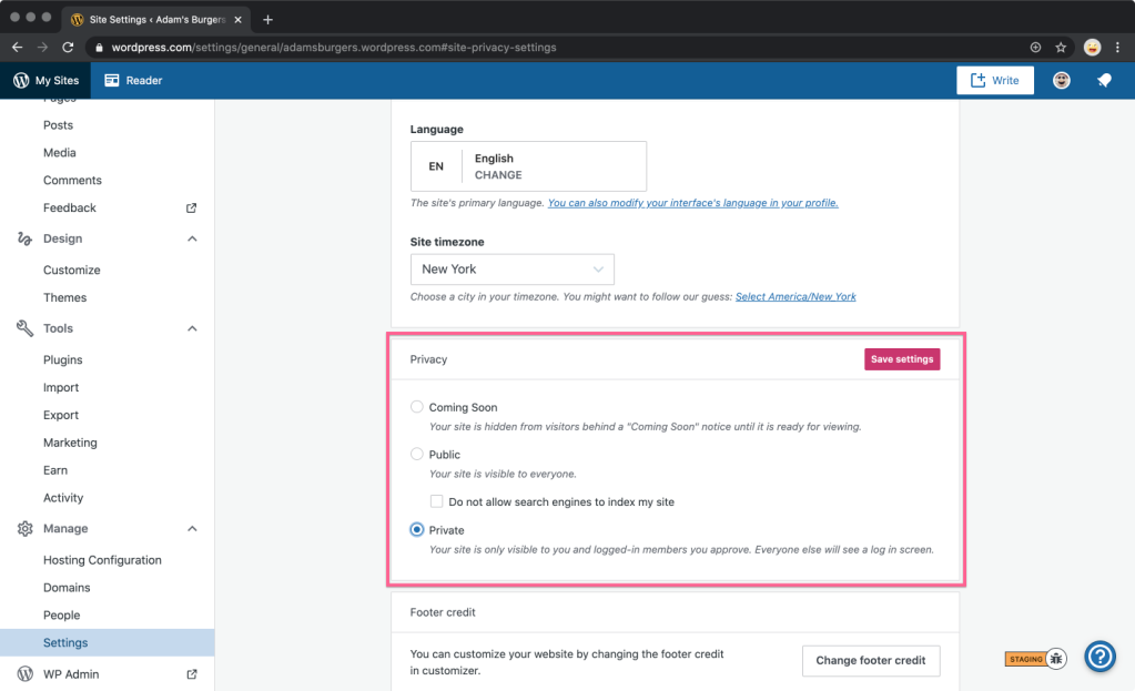
To set your site to Coming Soon, go to Manage in the sidebar, select Settings, scroll down to Privacy, and select the Coming Soon button. Be sure to click on Save settings for the change to take effect.

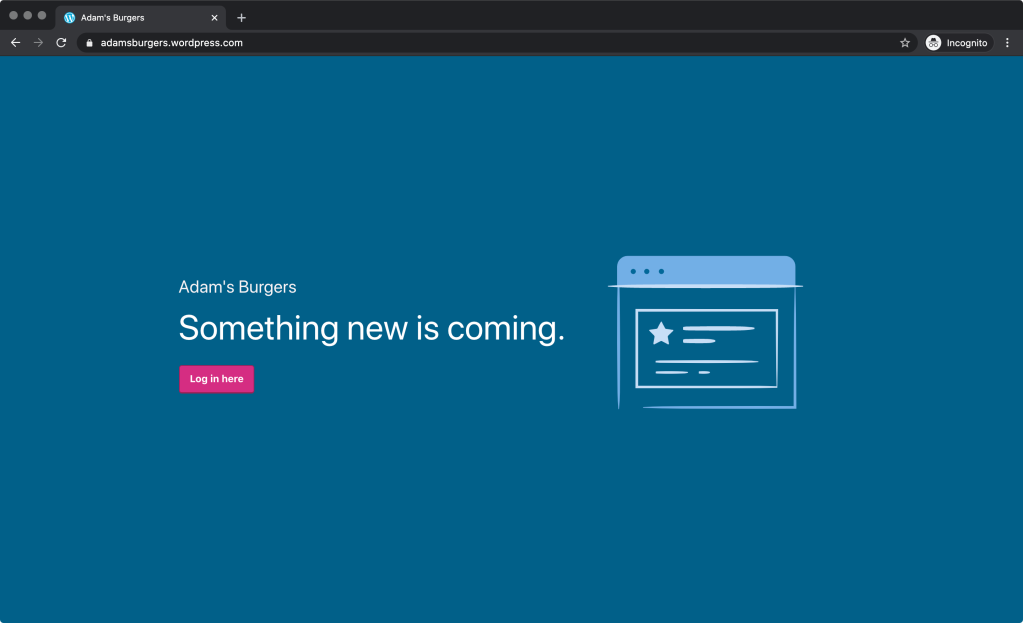
While in this mode, site visitors will see a landing page with your site’s title. You and other logged-in people that you invite will see the full website.

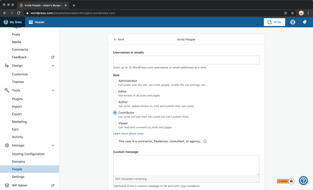
To invite people to view your site while in Coming Soon mode, add them as new users from the ManagePeopleInvite button. Users will need to at least be a Contributor to view the site in this mode.

To make your site public again, go to Manage in the sidebar, select Settings, scroll down to Privacy, and select the Public button. Again, be sure to click on Save settings.

Private sites for all

If instead of sharing your site with everyone, you want to keep it private, and only available to invited members of the site — for instance, a private blog for your family, made up of photos and videos of your children or pets — you can use the Private option under ManageSettingsPrivacy.

In this mode, instead of the Coming Soon landing page, logged-out visitors will see a more discreet prompt to log in.

No matter what you want to do on your site — whether making a few tweaks, refreshing your site design, or building a fully fledged online store — use the Coming Soon feature to keep it private until you’re ready to unveil it to the world.

We hope you enjoy this new feature!

Expert Advice: Business Fundamentals for Creative Professionals

Posted by download in Software on 15-05-2020

Are you an artist, photographer, or freelance writer? How about a website designer, master metalsmith, or musician? If you’re in any creative profession and would like to learn more about how to market and sell your services and work online, we’ve created a free webinar just for you.

We’ve partnered with our friends at FreshBooks, the leading invoicing and accounting software for creative entrepreneurs, to offer tips on how to build your online store and automate your sales and accounting, leaving you with more time to focus on your craft.

Date: Wednesday, May 20, 2020
Time: 10:00 a.m. PDT | 11:00 a.m. MDT | 12:00 p.m. CDT | 1:00 p.m. EDT | 17:00 UTC
Cost: Free
Registration link
Who’s invited: Artists, writers, musicians, website and graphic designers, photographers, marketers, and anyone else interested in learning how to sell their creative services online.

Your hosts will be Jonathan Wold, Community Manager at WooCommerce, and Irene Elliott, Senior Community Manager at FreshBooks. Dustin Hartzler, a WooCommerce Happiness Engineer, will moderate questions. After the 45-minute presentation, we’ll open up the (virtual) floor for a 15-minute Q&A session.

Attendee slots are limited, so be sure to register early to save your seat! But if you can’t make it, we’ve got your back. A recording of the webinar will be uploaded to our YouTube channel a few days after the event.

See you then!

The Month in WordPress: April 2020

Posted by download in Software on 04-05-2020

April continued to be a challenging time for the WordPress community, with many under stay-at-home recommendations. However, it was also an exciting month in which we created new ways to connect with and inspire each other! This month, amazing contributors moved more WordCamps online and shipped new releases for WordPress and Gutenberg. For the latest, read on. 


WordPress 5.4.1 released

On April 24th,  WordPress 5.4.1 Release Candidate 1 (RC1) was released for testing, quickly followed by the official release of WordPress 5.4.1 on April 29th. This security release features 17 bug fixes and seven security fixes, so we recommend updating your sites immediately. To download WordPress 5.4.1, visit your Dashboard, click on Updates, then Update Now, or download the latest version directly from WordPress.org. For more information, visit this post, review the full list of changes on Trac, or check out the version 5.4.1 HelpHub documentation page.

Want to get involved in building WordPress Core? Follow the Core team blog, and join the #core channel in the Making WordPress Slack group.

Gutenberg 7.9 and 8.0 released

It was another exciting month for Gutenberg, with the release of 7.9 and 8.0! Version 7.9 brought new block design tools, three new patterns, and improved block markup. Gutenberg 8.0 continued to refine the new block patterns feature, with additional options for inline formatting, and extending the functionality of the Code Editor. In addition to these new features, both releases included new enhancements and APIs, along with a number of bug fixes, performance improvements, some experiments, and more! You can read all the details about the latest Gutenberg releases in the announcement posts for 7.9 and 8.0

Want to get involved in building Gutenberg? Follow the Core team blog, contribute to Gutenberg on GitHub, and join the #core-editor channel in the Making WordPress Slack group.

BuddyPress 6.0.0

BuddyPress 6.0.0-beta2 was released for testing in mid-April, leading to the BuddyPress 6.0.0 Release Candidate, announced on April 29. This is an important step before  the final release of BuddyPress 6.0.0, which is slated for Thursday, May 14. Changes and new features in this release include moving the profile photo and user cover image under the BP Members component, and a new BP Rest API. Additionally, this release will introduce the first round of BuddyPress Blocks! Last, but not least, BuddyPress 6.0.0 will require at least PHP 5.6 and WordPress 4.8. 

Want to get involved? Test the 6.0.0-RC here! You can also help by translating BuddyPress into another language, or let the team know of any issues you find, either in the support forums and/or in their development tracker

WordCamp US goes online, apply to speak!

WordCamp US will take place online due to the COVID-19 pandemic. The event still runs from October 27-29, 2020, and will be free to anyone who wishes to attend. The team plans to offer  what WCUS has historically brought to the community in person: sessions and workshops, Contributor Day, a hallway track, and of course, State of the Word. 

Interested in speaking at WCUS? The Call for Speakers is still open! You can apply to speak on the speaker application site until May 31, 2020 at 11:59 pm CDT (UTC-5). 

Additionally, the Call for Cities is also open. If your community is interested in hosting WordCamp US in 2021 & 2022, please fill out this application

For the latest information about WordCamp US, sign up for updates on the website, or follow Facebook, Twitter, or Instagram

WordCamp Europe 2020 goes virtual 

Last month, WordCamp Europe decided to postpone its Porto event to 2021. This April, the WCEU organizing team announced that the 2020 WordCamp will be online! WordCamp Europe 2020 Online will take place from June 4-6, 2020, and tickets will be free. There will be a virtual Contributor Day on June 4, and then two half days of live-streamed talks and workshops. To participate, get your free ticket here

To get the latest news for WordCamp Europe 2020 Online, follow on Facebook, Twitter, LinkedIn, or on Instagram


Further Reading

Have a story that we should include in the next “Month in WordPress” post? Please submit it here.