Expanded Button Formatting, New Spacing Controls, and Drag-and-Drop for List View Now in Block Editor

Posted by download in Software on 31-08-2021

This month, our team released features in the block editor that give your site a little breathing room: spacing controls for buttons and paragraphs. And the List View tool keeps getting better with drag-and-drop.

Powerful Expanded Button Formatting

Buttons never looked so good with custom padding.

Padding is empty space within the border of a block, which can bring clarity to your content and adjust the balance of the page’s layout.

Custom control over a button’s spacing, color, and aggressiveness of the corner radii — all within the visual editor — can elevate it as a powerful design element of your website.

Make a punchy set of buttons themed in your brand’s colors or place an effective Call to Action button to attract your visitors.

To try, add a button with the Buttons block, and in the block’s menu go to the Dimensions section and select Padding. Adjust the padding uniformly around the button by changing the one value. If you click the unlink icon, you can adjust the four sides independently. Experiment with changing the Border and Color as well. To quickly create a grid of similar buttons, select the Options icon (…) in the toolbar above the block in your post editor and select Duplicate.

New Spacing Controls

Manually adjust the padding of other blocks as well, like a Paragraph block.

Custom-indent an entire section of text or generously pad a small amount of text for a big effect.

Experiment by wrapping a couple paragraphs with a Group block. Select the Group block and in the block’s menu go to the Dimensions section and select Padding. You can adjust the padding in this block just as you did with the button.

Drag-and-Drop for Persistent List View

We mentioned updates to the List View in June and July.

Accessible in the top-left menu of your post editor, the List View is the table of contents of all the blocks used in your post — select the diagonal hamburger icon to open this list. For deeply nested layouts, you can expand and collapse certain sections of this list, making navigation more efficient.

Now, with drag-and-drop functionality, you can reposition blocks within your post. Drag-and-drop a block within the list to reposition it, but if you prefer to organize visually, you can also drag the block’s label from the list into the post editor. List View is more powerful than ever to reorganize a post.

Keep Building, Keep Exploring

Your feedback is crucial to expanding the block editor’s capabilities, so keep it coming. Watch here for more updates, and in the meantime, go forth and create!

An Update on the Classic Editor Plugin

Posted by download in Software on 25-08-2021

Before the release of WordPress 5.0 in 2018, the Classic Editor plugin was published to help ease the transition to the new block editor. At the time, we promised to support the plugin through 2021 and adjust if needed as the deadline got closer. After discussing this with Matt, it’s clear that continuing to support the plugin through 2022 is the right call for the project as well as the community.

Still, if you’ve been putting off using the block editor, this is an excellent time to give it another shot. Since it first appeared in 2018, hundreds of WordPress contributors have made a lot of updates based on user feedback. You will be pleasantly surprised at how far it’s come!

Big thanks to everyone who has been working on WordPress, Gutenberg, and the Classic Editor plugin. And thank you to every WordPress user and tester who has provided the feedback we need to make the software even better.

~ Josepha

Returning to the block editor for the first time in a long time? You can give feedback early in the process by joining the outreach program! Looking at it for the first time ever? Get your bearings with some workshops or check out this demo!

WP Briefing: Episode 15: A Very WordPress Blooper

Posted by download in Software on 24-08-2021

Ever wonder what it’s like behind the scenes of WP Briefing? Listen in on this episode for a little levity and Josepha’s bloopers.

Have a question you’d like answered? You can submit them to wpbriefing@wordpress.org, either written or as a voice recording.

Credits

Transcript

[contemporary intro music]

Josepha Haden Chomphosy  00:10

Hello, everyone, and welcome to a bonus briefing. Normally I talk to you about WordPress and stuff, but I figured that we all need a little levity in our lives right now. So today’s episode is actually just a series of bloopers and mistakes that I’ve made while recording. When I was preparing for this podcast, no one mentioned the deep weirdness of standing alone in your closet talking to yourself, nor did they realize just how lost I can get in the surpassingly, lovely lyricism of a lilting line, and then just have no idea what I’m supposed to be reading in the script that I wrote for myself. So, my dear friends, I hope these bring you a little laugh. And if we’ve got any luck at all, you may also hear me singing to myself, my computer, or about how terrible my talking just was. Here we go!

Josepha Haden Chomphosy  01:12

Hello, everyone, and welcome to a bonus briefing. I know I wasn’t going to sit boop, boop. 

Josepha Haden Chomphosy  01:21

I messed up the thing where I’m talking about how I mess up, of course. I’m going to do it one more time, and you can choose whatever is a reasonable thing there. 

Josepha Haden Chomphosy  01:33

Because we had such a lengthy WP Briefing, WordPress, I’m going to just start that over again. Sorry, everyone.

Josepha Haden Chomphosy  01:42

My friends. Oh, no. I don’t know how I end my own show. How do I end my own show? There we go. Sorry. 

Josepha Haden Chomphosy  01:52

That was a weird way to say that. I’m going to start over again from the transition. And then we’re just going to go straight through to the end. Maybe.

Josepha Haden Chomphosy  02:03

The names that… I sound weird. I sound like I don’t know what my words are. And I said I wrote the words. I said I was all going to go in one go, and I’m a liar today. Okay, here we go. For realsies!

Josepha Haden Chomphosy  02:16

Final first last take. Here we go. Sorry, I made myself laugh. 

Josepha Haden Chomphosy  02:22

Matt Mullenweg. And, and I, I’m also in that group. I don’t know why I said that like it was a surprise. I have me too. I’m also in there. 

Josepha Haden Chomphosy  02:33

Ugh, I ran out of air. For reasons, it was a short sentence. I don’t know why I ran out of air. 

Josepha Haden Chomphosy  02:43

Coming out on April 14. That’s not true. It’s April 13. Right?

Josepha Haden Chomphosy  02:50

On the form below to share the. Pfft – what are the things! 

Josepha Haden Chomphosy  02:58

This is WP Briefing episode seven, no title because I don’t know what to call it because I gave it a title already. I gave it two titles, and then couldn’t remember why I gave it those titles. So I’ll come up with a title before we publish it. But I also have no idea what it is. I’m going to ask for help. 

Josepha Haden Chomphosy  03:17

Testing project since I have too many commas, and I really believed in my comma when I said it. 

Josepha Haden Chomphosy  03:24

Prior to Gutenberg… pfft. Open source software like WordPress. I was going to smash that sentence into half a sentence. I was going to say when you know what you’re workussing on you have a solution which is not my friends of thing. So, I am just going to say the sentence again. 

Josepha Haden Chomphosy  03:47

I was sitting over here wringing my hands for some reason during that entire list. And so if you can hear me wringing my hands, which would be a whole new height of anxiety for anyone, you let me know, and I will rerecord that also.

Josepha Haden Chomphosy  04:00

Get a concept of. Nope, this is a lie. Get a concept of where to get your tickets is the silliest thing. I’m starting over from the small list of big things. Also, because I got too excited about how big my list is. I am going to get that excited again. But I will try not to shout about it. 

Josepha Haden Chomphosy  04:17

“Humming intro song” Dun dun dun dun dun. 

Josepha Haden Chomphosy  04:23

Sorry, I had to scroll up, and I try not to scroll up when I’m talking in case maybe my whole computer turns into a microphone. Sorry, I’m just going to keep going because this has been a fine take so far. 

Josepha Haden Chomphosy  04:34

Mercy! I have words that I can say with my mouth. They aren’t these words today. It seems.

Josepha Haden Chomphosy  04:45

Build up to… Oh my goodness. My stomach grumbled, and this microphone, I know,  picked it up. And so I’m going to redo bullet two so that we don’t just have a small monster under the bed in the middle of the podcast. 

Josepha Haden Chomphosy  05:03

Also, like DEI, I feel s—Eh – maybe I should say, DEI, somewhere in there, so it’s clear for people cause I’m talking to people and not actually a screen. 

Josepha Haden Chomphosy  05:17

Before I joined the WordPress project, the majority of my work with accessibility was in the context of the digital divide. Now, when talking about the digital divide, there are three concepts around quote-unquote, getting things to people. And those concepts are… I guess I could say the thing, hold on one second, I can do it. I feel like I’m chopping up my words like I’m not really breathing very well. So I apologize. But here we go again.

Josepha Haden Chomphosy  05:58

Don’t include that one. Sorry, I’m so nervous about this episode that, like, my mouth is getting dry, and I worry that you can hear it, and it drives me nuts every time I hear podcasters with a dry mouth, and you can just like hear it clicking and always stresses me out. I’m like, someone should give that poor thing a drink of water. And I just know I’m going to feel that way about myself later. And so I’m trying to stay hydrated, but it also means that I have to stop every two paragraphs and take a drink of water. I apologize for that interlude. I am about to start again, at my next section, which is like, halfway through.

Josepha Haden Chomphosy  06:39

Also, I learned that you can hear me swallowing my water with this microphone because it is a spectacular microphone. And so, I apologize for that as well. All right. Here I go. I’m going to do it all in one take. Watch me. 

Josepha Haden Chomphosy  06:56

But I also have questions, especially about how to move everything forward. Mm-hmm. Whoops. I put especially in the wrong spot. But I also thought…

Josepha Haden Chomphosy  07:10

 Ta da, we did it. Gosh, that’s a short one. 

Josepha Haden Chomphosy  07:16

I did it. Where’s my where’s my turning offing button. 

Josepha Haden Chomphosy  07:22

Tada! And scene and done.

Meet the Customers We’re Featuring at the WordPress.com Growth Summit

Posted by download in Software on 16-08-2021

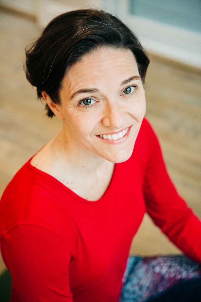
Last summer, as the world adjusted to pandemic life, Jessica Petrie knew that she had to make changes to how she ran her studio, Yoga Next Door

She quickly figured out how to stream her classes from her studio in the beautiful woods of Maine, and adapted her business model to offer video learning and online payment. While looking forward to a return to in-real-life classes and retreats, she refused to be set back by the pandemic, and found a way to allow her students to continue their yoga practice from the safety of their homes. 

We are always learning from customers like Jessica — or Steven Gaither, Wali Pitt, and Tolly Carr of HBCU Gameday. The trio doubled down on understanding their growing audience, while staying focused on their important coverage of sports and culture at Historically Black Colleges and Universities. Their expert use of SEO tools has helped them increase site traffic along the way. 

They are not alone: many WordPress.com creators have grown their audiences while publishing on social and cultural movements around the world, signaling their resilience, adaptability, and impact in challenging times.

We are proud to feature Jessica Petrie, HBCU Gameday, and other inspiring customers at the second Official WordPress.com Growth Summit, on Tuesday, August 17 (Wednesday, August 18, for Asia-Pacific timezones). You can still buy your ticket and learn from these incredible customers:

Muslim Girl

Amani al-Khatahtbeh started a website, Muslim Girl, and a movement. Whether highlighting prominent Muslim women in the Olympics or in the media, or diving into issues like human trafficking and marriage in modern Islam culture, Amani has created a platform focused on raising awareness, amplifying young voices, and fostering open dialogue. Beyond this, Amani is building a community around the diverse identities of Muslim women in the West — on #MuslimWomensDay (heading into its sixth year next March) and every day.

CalMatters

CEO Neil Chase and VP of Product Strategy Kim Fox will talk about their nonprofit, nonpartisan newsroom, CalMatters, with our own Kinsey Wilson, the head of Newspack (the open-source publishing and revenue-generating platform for news organizations.) CalMatters not only covers policy and politics in California; they also help empower emerging publishers with their digital platforms. We’ll learn how they started, how they sustain their operation, and what they see ahead in digital news.

Zaloa Languages 

Anja Spilker is the founder of Mexico-based company Zaloa Languages, which offers online language learning with native teachers to an international audience. Anja is that rare and powerful combination of founder, CEO, and influencer. She’s equally adept at sharing her life behind the scenes as she is in shifting her business model, significantly increasing revenue, and creating a compelling brand with a sophisticated ecommerce approach. Listening to her tell the story of Zaloa Languages will be a masterclass on its own.

HBCU Gameday 

With HBCU Gameday, Steven J. Gaither spotted an underrepresented niche in the vast sports media landscape. He teamed up with experienced journalist Tolly Carr and digital technologist and video producer Wali Pitt to create a publication with an important focus on HBCU sports stories of culture and substance.  They’re hands-on in understanding how their audience finds them, all while adopting new formats (video!) seamlessly.

Workprint

David Nitzche is a master of short-form storytelling, and he’s making a business out of it. We’ll learn how he weaves trailers, music videos, and creative for Apple, Marvel, National Geographic, Red Bull, Netflix, Google, and more. David will also talk about how he’s evolved his career from freelance editor to launching his own post-production studio, Workprint, in Los Angeles in the middle of the pandemic.

Yoga Next Door 

If the story of how Jessica borrowed her son’s GoPro camera to quickly experiment with offering her classes by online video doesn’t inspire you, Yoga Next Door’s return to real-life retreats will. But you just may learn most from Jessica’s  on-the-fly business savvy, including how she set up a digital library for customers while continuing to share her mindfulness and yoga expertise willingly. (So willingly that she’ll offer attendees a mid-Summit yoga and mindfulness session.)

STATURE

Which of Nick Engvall’s ventures can you learn most from? We found him via Sneaker History, the podcast he launched with and for fellow sneakerheads, drawing on his own content-creating background with brands like StockX and Finish Line. But we’ll also explore his creative agency STATURE, his hands-on thought leadership for podcasters and creators, his advocacy of WordPress, and how he finds time for it all!

If we have time, that is. Because all of these speakers have many stories to tell and ideas to share, and we have a packed Summit agenda that also includes sessions with our own talented Happiness Engineers, who will lead workshops on blogging, podcasting, building an audience, and SEO.

We hope you’ll join us at the Summit this week — and just as importantly, we hope you’ll keep working on your thing, too. We’d love to feature you someday soon.

Faster, More Flexible Editing of Your Sidebars, Headers, and Footers: Blocks for Widgets

Posted by download in Software on 10-08-2021

The block editor makes site creation fast and flexible. Now, you can use that same huge library of blocks available when editing your pages and posts to edit and customize your sidebars, headers, and footers.

What are Widgets?

Sidebars, headers, and footers on your WordPress.com website are powered by widgets. Widgets are small but powerful modules to arrange and display content and tools around the edges of your posts and pages. Until now, widgets have been the best way to insert a variety of content — from calendars to social icons — into the sidebar, header, and footer of your site.

Flexibility with the Block Editor

Setting up and managing widgets was a very static and often tricky process. The block editor you’re familiar with in pages and posts is now part of the widgets editor. This aims to put editing power in your control.

You’re no longer limited to just widgets — any block is for your choosing.

For example, in your sidebar, header, and footer, you can now:

  • Tweak the structure by adding columns or spacers
  • Quickly add content like a Search block or a header
  • Format content via colors and rich text editing

What About Older Widgets?

Every widget that exists today will be incorporated into blocks.

But don’t worry — your current widgets will still work and can be used alongside your other blocks. Even legacy widgets that don’t have a block equivalent will work. Just use your preferred method of inserting a block, search for the widget’s name, and insert.

Getting Started

If you’ve never edited the content in your sidebar, header, or footer, now is a great time to experiment!

To edit the content, go to Appearance → Customize → Widgets and you’ll now be able to directly add widgets and any blocks, while previewing exactly what they’ll look like on your site.

This update is just one more step on the way to a more intuitive site editing experience. Go forth and create!

Widgets in WordPress 5.8 and Beyond

Posted by download in Software on 09-08-2021

Copy and Design by @critterverse

WordPress 5.8 brings the power of Gutenberg blocks to widget areas — which means the highly customizable layout and styling options bring you closer to a WYSIWYG editing experience. I made a test site based on the oldie-but-goodie Twenty Sixteen theme, with three separate widget areas. In this post, I’ll highlight a few cool things that are now possible to do with your widgets and where things may be heading next.

A zoomed-out view of a single post with one sidebar widget area and two footer widget areas. The site content is about Marine Park Salt Marsh. A List View of blocks floating next to each widget area shows how the design is constructed.


Create Interesting Visual Effects With Overlapping Layouts and Duotone Images

Appearance-wise, users have a lot more control over widget areas than ever before — especially through the use of blocks with customization options like the Cover and Image block. Here’s what I can create in the classic widgets editor (above) versus what I can create in the new block-based widget editor (below).

Intersperse Widgets and Custom Code Throughout Your Visual Designs

Container blocks like Cover and Columns make it easy to weave dynamic or interactive elements into your designs. While this is a given for many widgets, the block versions of widgets can be easily wrapped and layered within container blocks to integrate them into your layout more fully.

In the example below, I tried placing a Search block in front of a Cover block, which creates a nice layered effect. I also inserted Custom HTML blocks within a Columns block to display different messaging depending on the time of day. (jQuery script)

Use Traditional Widget Layouts (Or Not) With Lots of Flexibility Over Title and Structure

Classic widgets have always had a lockup that includes a widget title. One cool thing about having blocks in widget areas is that you have complete flexibility over how titles appear. For example, you might choose to have a title over every widget, you might only want one title at the top of each widget area, or your design might not need titles at all.

Note: Some themes, like Twenty Twenty-One, are designed to flow content horizontally within widget areas. If you’re having trouble with a theme splitting your layout into columns, you could try keeping the lockup together by containing it within a Group block.

Side-by-side comparison of List View of a Sidebar widget area with and without grouped/nested lockups.

Copy & Paste Existing Layouts From the WordPress Pattern Directory

While patterns haven’t been fully integrated into the widget editors yet, one thing you can do is copy and paste patterns from the game-changing new WordPress Pattern Directory into your site’s widget areas. I used this horizontal call to action pattern from the directory almost exactly as is, with minor color and copy adjustments:

Footer widget area with a black box that reads, “Become a monthly patron” with paragraph text and a “Join now” button in a separate column. A painted image of waves hitting rocks is directly below with no space between them.

FYI: Patterns have not been curated for or integrated into widget areas yet, so you may run into some unexpected behavior — consider this feature to be a preview of what’s coming next for widget editing!

The Month in WordPress: July 2021

Posted by download in Software on 03-08-2021

WordPress is global in reach and open source in nature. And you would assume that what allows the software to be used by anyone would also enable it to be built by anyone. After all, your location doesn’t matter, and who employs you also doesn’t matter. And your relative social standing certainly shouldn’t matter. As long as you can communicate with the others contributing to the project, there should be no obstacle to your participation.

That was Josepha Haden on the “Cherishing WordPress Diversity” episode of the WP Briefing Podcast, speaking about the importance of diversity, equity, and inclusion within the fabric of the WordPress project. Her statement captures the spirit of the WordPress open source project, and we hope it resonates with you. Now, let’s dive in!


Say hello to WordPress 5.8

WordPress version 5.8, “Tatum,” came out on July 20. Version 5.8 is a major release that offers features like block-based widgets, a host of new blocks and patterns, a template editor, a duotone feature to stylize images, theme.json, and support for webP images, to name a few. Read more in the release post, the field guide, and the talking points post for meetup groups.

Want to contribute to WordPress core? 

Gutenberg Version 11.0 is released

Contributor teams released the 11th version of Gutenberg on July 9. Version 11.0, which focuses heavily on backports and bug fixes, showcases some cool features such as an editing overlay for template parts and reusable blocks, and support for CSS shorthand properties in theme.json and block attributes. Version 11.1 was also shipped this month, on July 21. The release adds custom block borders as block supports and adds “drag and drop” to the list view. 

Want to get involved in building Gutenberg? Follow the Core Team blog, contribute to Gutenberg on GitHub, and join the #core-editor channel in the Make WordPress Slack. The “What’s next in Gutenberg” post offers more details on the latest updates. 

Returning to in-person WordPress events

The Community Team kicked off work to bring back in-person WordPress events. The team recently announced that in-person WordPress meetups can be organized in a region if the local public health authority allows in-person events and if the region passes the in-person safety checklist. If the region does not meet guidelines on page one of the safety checklist, organizers can plan events for fully vaccinated, recently tested (negative), or recently recovered community members. Subsequently, the team also shared a proposal for the return to in-person WordCamps in places that meet the safety guidelines and the vaccination/testing requirements. Please share your feedback on the post if you have any thoughts. For more context, check out the “In Person!” episode of the WP Briefing Podcast

Want to contribute to the Community Team? Follow the Community Team blog, or join them in the #community channel in the Make WordPress Slack. 

BuddyPress 9.0 is out

The BuddyPress team is busy! Within barely a month of their last major release (version 8.0), the team shipped version 9.0 on July 19. Key features of the release include widget blocks and updates to the BP REST API.  Download it from the WordPress.org plugin directory or check it out from its subversion repository. Want to help build BuddyPress? Follow their developer relations blog, check out their handbook page, or join them in the #buddypress channel in the Make WordPress Slack.

WordPress Event updates

Feedback requests from WordPress contributor teams

Please help these WordPress contributor teams by answering their research requests:


Further reading

Have a story that we should include in the next “Month in WordPress” post? Please submit it using this form

The following folks contributed to July’s Month in WordPress:  @webcommsat @chaion07 @lmurillom @meher

5 Ways to Get Started On Your Side Hustle

Posted by download in Software on 03-08-2021

At Automattic, we believe in making the web a better place by helping people get access to powerful tools that help them tell their stories and turn their passion into an income generator.

During the pandemic, we noticed that people were focusing on their side hustle and building a trusted brand online. We’re focused on making it easier and quicker to launch your website, so that you can focus on building your community. 

Here are five ways to get started: 

  1. Create your website on WordPress.com
  2. Get your own domain name to make it easier for people to find you
  3. Setup Professional Email to connect with customers using your own domain
  4. Create a logo to make your brand memorable
  5. Start collecting payments with Earn tools 

Whether you’re a blogger, an entrepreneur, a small business owner, an artist, an educator, or you have a new idea you want to turn into a side hustle, we want you to have the opportunity to amplify your message through the web and find your own community and customers here. We’re ready to help you get started on your journey. Are you ready?

Start my three-month free trial for Professional Email!

WP Briefing: Episode 14: The Art and Science of Accessibility

Posted by download in Software on 02-08-2021

In this episode, Josepha Haden Chomphosy discusses the nuances of building accessible software, the differences between access, usability, and accessibility, and how this all applies to the WordPress project.

Have a question you’d like answered? You can submit them to wpbriefing@wordpress.org, either written or as a voice recording.

Credits

References

Transcript

[contemporary intro music]

Josepha Haden Chomphosy 0:10

Hello, everyone, and welcome to the WordPress Briefing, the podcast where you can catch quick explanations of the ideas behind the WordPress open source project, some insight into the community that supports it, and get a small list of big things coming up in the next two weeks. I’m your host, Josepha Haden Chomphosy. Here we go.

[musical interlude]

Josepha Haden Chomphosy 0:28

This is the second of my big scary topics for this month. I’ll be talking about accessibility, which much like Diversity, Equity and Inclusion, or DEI in the last episode, is one of those areas where the work is never finished. Also, like DEI in last episode, I feel strongly about accessibility and the need for accessible experiences in the world, but I’m aware that this is an area where I’m still learning.

Josepha Haden Chomphosy 1:04

WordPress has both an accessibility statement and team, which makes a lot of sense given that the software supports so many different people, and industries, and cultures. But if you’re not quite bought into the idea that software should be accessible, or that accessible software can’t also be usable, then this is the episode for you.

Josepha Haden Chomphosy 1:25

Before I joined the WordPress project, the majority of my work with accessibility was in the context of the digital divide. Now, when talking about the digital divide, there are three concepts around quote-unquote, “getting things to people,” and those are access, usability, and accessibility. Sometimes these words seem interchangeable, but ultimately they have nuanced differences that address different problems. And I like to think of them this way.

Access is making sure that someone can obtain something.

Usability is making sure that the user experience is understandable or coherent.

And accessibility is making sure that it’s usable by the largest number of people.

I have always considered each as a subset of the one that came before it. So having something everyone can access is good, but easy to access and easy to use is better. Easy to use is good, but easy to use and easily accessible is better.

Josepha Haden Chomphosy 2:27

After joining WordPress, I discovered that accessibility in the context of software building is well, substantially more complicated. There’s no such thing as perfect accessibility, or a site that is 100% accessible, and many aspects are pretty open to interpretation. It turns out that accessibility, like so many things in WordPress, is a complicated intersection of art and science.

As an example, there’s a rule that says, “Ensure that links are recognizable as links.” A fast shorthand to accomplish that, that we see all over the internet, is to underline all links or put that icon next to it that says, “This opens in a new tab.” You know that icon that’s a box with an arrow? That definitely has a name, that I definitely don’t know? That icon. [laughing] But those solutions don’t necessarily fit every context that you’ll find a link in, and that’s where we see that intersection between the art of communication and the science of necessity.

Josepha Haden Chomphosy 3:32

If you came with me earlier on the idea that accessibility is a subset of usability, and it’s not a far leap to say that the choices around accessibility implementations should always include design and the overall user experience.

I know that some of you are thinking, “But we have guidelines! Like, that’s why we have the guidelines, so that not everything has to be a gray area.” And on the one hand, yeah, that’s true. There are a lot of guidelines. There are guidelines for the code, and what the code produces, and the design elements. But I worry that when a solution is driven solely by rules, rather than reasons, we run the risk of throwing out the good along with the bad.

Josepha Haden Chomphosy 4:15

Accessibility has been a consistent topic of debate in the project for as long as I can remember, and based on all of this, it’s really clear why. There are a few big picture questions that still deserve some sort of canonical answer for WordPress, and where possible I dig in and research the positions that everyone has taken in the past. But I also have questions about how to move everything forward, especially as the editing experience gets more and more standardized across the software, which reduces cognitive load, shortens the learning curve, etc.

What is the future possibility for having a series of more niche admin interface options?

What would it be like to be able to account for functional limitations in a way that lets site builders select what is needed for their clients or organization, or just individual situations they know their sites would be maintained under?

What more could we do if part of the setup flow of WordPress was to select some bundle of potential add ons for neuro diversity, or colorblindness, or dyslexia, and more?

It’s a really big question I have.

Josepha Haden Chomphosy 5:26

And I have to be really transparent here and share that my foundational understanding of accessibility and usability is 10 plus years old, and I learned it in the context of people in education, not software. So a lot of my questions about the future of accessibility and WordPress is the result of old knowledge exploring new spaces, which means they are a little untested. And I’m so grateful for the contributors who point out what the current research and thinking is, in this incredibly complex field.

Josepha Haden Chomphosy 6:00

I normally like to wrap up the briefing with a tidy takeaway, but this particular topic doesn’t really lend itself to that. So I’ll leave you with this. I really believe in WordPress’ mission to democratize publishing. And I, for one, will never stop learning about what gives people more access to the software, and what makes the software more usable, and especially how we can combine usability with accessibility in a way that puts form and function on a level playing field.

[musical interlude]

Josepha Haden Chomphosy 6:40

And now, that brings us to our small list of big things.

Thing one, it’s that time of year where many of our community members take a short break to relax and refresh. I’ll be taking a bit of a break during the month of August, and so the WP Briefing will return again starting in September.

And thing two, huge thanks to the production crew that helps me make this podcast every couple of weeks, but a special shout out to our editor Dustin Hartzler, who makes quick work of all of my rambling thoughts.

Josepha Haden Chomphosy 7:09

And that is your small list of big things. Thank you for tuning in today for the WordPress Briefing. I’m your host, Josepha Haden Chomphosy, and I’ll see you again in September.

[contemporary outro music]